I have been trying to self-learn the field of Digital Signal Processing (DSP) since the last year. However, it seems I lost the motivation at some points and got busy with my other works too. The key information source for my self-learning approach was the book The Scientist and Engineer's Guide to Digital Signal Processing by Steven W. Smith. There are two great things about this book. First, it avoids mathematical jargons as much as possible when explaining concepts unlike many other DSP books. Second, it is freely available either to read on-line or to download for reading off-line.
I kept reading this book and when I come across something hard to understand, I skipped it even though that is not a good way to deal with hard to understand things. Somewhere after chapter 10, I got lost and gave up with reading it. But it seems it's hard to live on this planet without DSP and I decided to start it all over again. This time, my approach is different. I decided to take a more practical approach where I will write some codes and try the concepts presented in the book to see and understand them by doing. Let's see how it goes.
In this post, I'm going to write down some of the most basic stuff I came across while reading through the book's first two chapters.
- What is a Signal ?
This is the first and one of the most important terms we come across while learning DSP. A Signal is a parameter that varies with another parameter in a system. Take the temperature of a room as an example which varies over time. We will be measuring the temperature in degrees of Celsius and the time in seconds. We can consider the temperature measurement as the parameter which varies with the time parameter. So, this temperature variation is a Signal. Take a look at the following graph which illustrate this signal.
 |
| Fig-1: Variation of temperature over time (mythical data) |
1 2 3 4 5 6 7 8 9 10 11 12 13 14 15 16 17 18 19 20 21 | import matplotlib.pyplot as plt import numpy as np from random import gauss # generating dummy temperature data over time sample = 60 x = np.arange(sample) temp = list() for i in range(0,sample): temp.append(gauss(27,0.1)) # gauss(mean, std) y = np.array(temp) # plotting the signal waveform #plt.title('Waveform of temparature signal') plt.xlabel('Time (s)') plt.ylabel('Temperature (C)') plt.ylim(25, 29) plt.grid(True) plt.plot(x, y) plt.show() |
It is really important to note that it is not necessary for the second parameter to be time always. The second parameter can be anything. For example, let's modify the above scenario slightly. We will place an array of 10 temperature sensors across the room with a 1 meter distances from each adjacent sensor and then take a temperature measurement from each of them at a single instance of time. So, this time we get a variation of temperatures in the room not over time but over space. We can take the second parameter as the distance from one corner of the room. Take a look at the following graph which illustrates this. Still, this is a signal.
 | |
| Fig-2: Variation of temperature over space (mythical data) |
1 2 3 4 5 6 7 8 9 10 11 12 13 14 15 16 17 18 19 20 21 | import matplotlib.pyplot as plt import numpy as np from random import gauss # generating dummy temperature data over space sample = 10 x = np.arange(sample) temp = list() for i in range(0,sample): temp.append(gauss(27,0.2)) # gauss(mean, std) y = np.array(temp) # plotting the signal waveform #plt.title('Waveform of temparature signal') plt.xlabel('Distance (m)') plt.ylabel('Temperature (C)') plt.ylim(25, 29) plt.grid(True) plt.plot(x, y) plt.show() |
- What is the Waveform of a signal ?
When we plot the variation of the first parameter against the second parameter of a signal, what we get is the Waveform of the signal. In the previous two scenarios, what we have drawn are Waveforms of the two signals. It shows the shape of our signal nicely. But, there are some other aspects of a signal to look at other than its Waveform. We will see them later.
- Mean and Standard deviation of a signal
Now we know what signals are and how to represent their waveform in a graph. By looking at the source codes shown above, it is obvious that we can simply represent any signal in an array in computer memory. When we have a signal, we can look at their statistical properties and the most important two properties comes in to the stage are Mean and Standard deviation of the signal's data samples.
Mean (\( \mu \)) is simply the average value of the data points in a signal. Mathematically, it can be represented as follows where \( x \) is the array containing our signal.
$$\mu = \frac{1}{N} \sum_{i=0}^{N-1} x_i$$
Standard Deviation (\( \sigma \)) of a signal is a measure of how much the signal data points are deviated from the mean value of the signal. Mathematically, it can be represented as follows where \( x \) is the array containing our signal and \( \mu \) is the mean of the signal which we have calculated already.
$$\sigma^{2} = \frac{1}{N-1} \sum_{i=0}^{N-1} (x_i - \mu)^{2}$$
Following program reads a wave file and then calculate the mean and standard deviation of the signal. It is interesting to note that a wave file is in stereo format where we have two channels. Therefore, we select one channel to plot the waveform graph as shown in the code example.
When we are looking at a signal coming from some source, the mean value represents the actual value which we need to observe. Meanwhile, the standard deviation represents the errors or the noise that deviate our observed values. Therefore, we can divide the mean by standard deviation to get a ratio which represents how good our signal is compared to the background noise. We call this ratio Signal-to-Noise ratio or SNR.
I like the following explanation given in Stack Exchange by John D. Cook. It illustrates the difference between probability and statistics in a nice way.
Let's say we have a jar of red and green jellybeans. "A probabilist starts by knowing the proportion of each and asks the probability of drawing a red jelly bean. A statistician infers the proportion of red jelly beans by sampling from the jar."
Now we are going to look at another way of illustrating a signal graphically. Let's think about our temperature measurement experiment again. We have a temperature sensor along with a clock so that we can take readings of room temperature at equally spaced time intervals. We can draw the waveform of this signal as follow.
We can see from the waveform graph that same temperature reading can be measured at different discrete time instances. If we count the number of instances each temperature value has occurred in our signal, we can plot it in a histogram. The x-axis will be temperature values while the y-axis will be the count or number of times that temperature value is available on the signal. We can draw this histogram as follows.
We can use the following python script to generate the above graphs.
For a continuous signal, probability density function (PDF) has the x-axis with some parameter and the probability of getting that value in the y-axis. The graph shown below is the waveform for a signal. Let's say it was obtained by sampling the temperature in a room for a duration of 1 hour (3600 seconds). Probability density function for this signal has temperature in the x-axis and the probability of getting that temperature within the 1 hour period is given in the y-axis.
This is what we get if we generate the probability density function for the signal we considered. In this case, we have received a Gaussian distribution shaped graph since our signal contains data which has a Gaussian distribution.
$$\mu = \frac{1}{N} \sum_{i=0}^{N-1} x_i$$
Standard Deviation (\( \sigma \)) of a signal is a measure of how much the signal data points are deviated from the mean value of the signal. Mathematically, it can be represented as follows where \( x \) is the array containing our signal and \( \mu \) is the mean of the signal which we have calculated already.
$$\sigma^{2} = \frac{1}{N-1} \sum_{i=0}^{N-1} (x_i - \mu)^{2}$$
Following program reads a wave file and then calculate the mean and standard deviation of the signal. It is interesting to note that a wave file is in stereo format where we have two channels. Therefore, we select one channel to plot the waveform graph as shown in the code example.
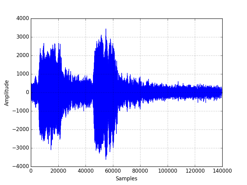 |
| Fig-3: Waveform of a sound from an Owl |
1 2 3 4 5 6 7 8 9 10 11 12 13 14 15 16 17 18 19 20 21 22 23 24 25 26 27 28 29 30 31 | from random import randint from random import gauss import numpy as np import matplotlib.pyplot as plt from scipy.io import wavfile # read a signal from a Wav file fs, data = wavfile.read("owl.wav") # fs=sample rate, data=signal # data has a value range from -2^15 to (2^15)-1 # because the data type is int16 # extract data from channel 0 (our wav file is stereo which has two chanels) data = data[:, 0] # to extract data from channel 1 #data = data[:, 1] # showing the properties of the signal print 'data:', data print 'mean:' ,np.mean(data) print 'std:', np.std(data) print 'SNR:', np.mean(data)/np.std(data) # showing the waveform of the signal in channel 0 #plt.title("Waveform (channel 0)") plt.xlabel("Samples") plt.ylabel("Amplitude") plt.grid(True) plt.xlim(0,140000) plt.plot(data) plt.show() |
- What is Signal-to-Noise Ratio (SNR) of a signal ?
When we are looking at a signal coming from some source, the mean value represents the actual value which we need to observe. Meanwhile, the standard deviation represents the errors or the noise that deviate our observed values. Therefore, we can divide the mean by standard deviation to get a ratio which represents how good our signal is compared to the background noise. We call this ratio Signal-to-Noise ratio or SNR.
- Probability vs Statistics
I like the following explanation given in Stack Exchange by John D. Cook. It illustrates the difference between probability and statistics in a nice way.
Let's say we have a jar of red and green jellybeans. "A probabilist starts by knowing the proportion of each and asks the probability of drawing a red jelly bean. A statistician infers the proportion of red jelly beans by sampling from the jar."
- Histogram of a signal
Now we are going to look at another way of illustrating a signal graphically. Let's think about our temperature measurement experiment again. We have a temperature sensor along with a clock so that we can take readings of room temperature at equally spaced time intervals. We can draw the waveform of this signal as follow.
 |
| Fig-4: Waveform of a the temperature signal over time |
We can see from the waveform graph that same temperature reading can be measured at different discrete time instances. If we count the number of instances each temperature value has occurred in our signal, we can plot it in a histogram. The x-axis will be temperature values while the y-axis will be the count or number of times that temperature value is available on the signal. We can draw this histogram as follows.
 |
| Fig-5: Histogram of the temperature signal |
We can use the following python script to generate the above graphs.
import matplotlib.pyplot as plt
import numpy as np
from random import gauss

# generating dummy temperature data over time
sample = 60
x = np.arange(sample)

temp = list()
for i in range(0,sample):
    temp.append(gauss(27,0.5)) # gauss(mean, std)
y = np.array(temp)

# plotting the signal waveform
#plt.title('Waveform of temparature signal')
plt.xlabel('Time (s)')
plt.ylabel('Temperature (C)')
plt.ylim(25, 29)
plt.grid(True)
plt.plot(x, y)
plt.show()

# plotting the histogram
plt.hist(y, normed=True)
#plt.title("Histogram of temperature signal")
plt.xlabel("Temperature (C)")
plt.ylabel("Frequency")
plt.grid(True)
plt.show()
- Probability Density Function (PDF) for a signal
For a continuous signal, probability density function (PDF) has the x-axis with some parameter and the probability of getting that value in the y-axis. The graph shown below is the waveform for a signal. Let's say it was obtained by sampling the temperature in a room for a duration of 1 hour (3600 seconds). Probability density function for this signal has temperature in the x-axis and the probability of getting that temperature within the 1 hour period is given in the y-axis.
 |
| Fig-6: Waveform of a the temperature signal over 1 minute duration |
This is what we get if we generate the probability density function for the signal we considered. In this case, we have received a Gaussian distribution shaped graph since our signal contains data which has a Gaussian distribution.
 |
| Fig-7: Probability density function of a the temperature signal |
import matplotlib.pyplot as plt
import numpy as np
from random import gauss
from scipy.interpolate import UnivariateSpline

# generating dummy temperature data over time
sample = 3600
x = np.arange(sample)

temp = list()
for i in range(0,sample):
    temp.append(gauss(27,0.5)) # gauss(mean, std)
y = np.array(temp)

# plotting the signal waveform
#plt.title('Waveform of temparature signal')
plt.xlabel('Time (s)')
plt.ylabel('Temperature (C)')
plt.ylim(25, 29)
plt.grid(True)
plt.plot(x, y)
plt.show()

# plotting the PDF
p, x = np.histogram(y, bins=sample)
x = x[:-1] + (x[1] - x[0])/2   # convert bin edges to centers
f = UnivariateSpline(x, p, s=sample)
plt.plot(x, f(x)/sample)
#plt.title("PDF of temperature signal")
plt.xlabel("Temperature (C)")
plt.ylabel("Probability")
plt.grid(True)
plt.show()
- Gaussian (normal) Distribution
When we sample a random variable which we find in the natural world, most of the times they are normally distributed. That means its distribution is a Gaussian (Normal) distribution that has a bell shape. Shape of this bell is controlled by the mean and standard deviation of the signal we are considering. Following equation illustrates the probability density function for the Gaussian distribution according to Wikipedia.
$$f(x \mid \mu,\sigma^2) = \frac{1}{\sqrt{2 \sigma^2 \pi}} \rm{e}^{-\frac{(x-\mu)^2}{2\sigma^2}} $$
Here are some Gaussian distributions for different mean \( \mu \) and standard deviation \( \sigma \) values. Python scripts used to generate these distributions are given after that.
 |
| Fig-8: Gaussian distributions for different mean and standard deviations. |
import matplotlib.pyplot as plt
import numpy as np
from random import gauss
from scipy.interpolate import UnivariateSpline

# generating dummy temperature data over time
sample = 100000

temp = list()
for i in range(0,sample):
    temp.append(gauss(0,1)) # gauss(mean, std)
y0 = np.array(temp)

temp = list()
for i in range(0,sample):
    temp.append(gauss(0,0.2)) # gauss(mean, std)
y1 = np.array(temp)

temp = list()
for i in range(0,sample):
    temp.append(gauss(2,0.5)) # gauss(mean, std)
y2 = np.array(temp)

# plotting the PDF
p, x = np.histogram(y0, bins=sample)
x = x[:-1] + (x[1] - x[0])/2   # convert bin edges to centers
f = UnivariateSpline(x, p, s=sample)
plt.plot(x, f(x)/sample)

# plotting the PDF
p, x = np.histogram(y1, bins=sample)
x = x[:-1] + (x[1] - x[0])/2   # convert bin edges to centers
f = UnivariateSpline(x, p, s=sample)
plt.plot(x, f(x)/sample)

# plotting the PDF
p, x = np.histogram(y2, bins=sample)
x = x[:-1] + (x[1] - x[0])/2   # convert bin edges to centers
f = UnivariateSpline(x, p, s=sample)
plt.plot(x, f(x)/sample)

#plt.title("PDF of temperature signal")
plt.xlabel("x")
plt.ylabel("y")
plt.grid(True)

plt.legend(['mean=0,std=1', 'mean=0,std=0.2', 'mean=2,std=0.5'], loc='upper left')
plt.show()
- Cumulative Distribution Function (CDF)
The cumulative distribution function of a normal distribution is the sum of probabilities of the x-axis variable in normal distribution up to each x-axis variable. Following graph illustrates this concept where the y-axis values vary between 0 and 1 since the total probability is 1 for all the x-axis values.
 |
| Fig-9: CDF for a normal distribution. |
from random import gauss
import numpy as np
import matplotlib.pyplot as plt
from scipy.io import wavfile

# generating a gaussian random signal
x = list()
for i in range(0,10000):
    x.append(gauss(0,10)) # gauss(mean, std)
x = np.array(x)

# showing the CDF of a signal
X = np.sort(x)
F = np.array(range(len(x)))/float(len(x))
plt.plot(X, F)
#plt.title("CDF")
plt.xlabel("Value")
plt.ylabel("Cumulative Frequency")
plt.grid(True)
plt.show()
- Precision vs Accuracy of a measurement
I had came across these terms frequently at different places but it was only after reading the DSPGuide book I understood the true difference between then in terms of taking a measurement. When we talk about Precision of a measurement, we are talking about maximum variation or the possible error that can occur in successive measurements. When considering Accuracy, we are talking about how close our measurement is to the actual value that we are trying to measure.
I'll write more when I proceed to the next chapters of the book. Until then, enjoy processing digital signals!!!
No comments:
Post a Comment